Design System
This design system was built on top of MUI, but fully customized to match our product’s branding, tone, and UX needs. I redefined all base components—like buttons, inputs, and menus—using design tokens for consistent color, spacing, and typography. Everything was documented in Figma and structured to mirror our code system. I worked closely with developers to sync these tokens with GitLab, improving design-to-dev handoff and reducing redundant work across teams.
Why We Needed a Design System
When I joined the team, it quickly became clear that we were growing fast—but our UI wasn’t keeping up.
Designers were rebuilding the same components from scratch. Developers were implementing one-off styles. And features that should have felt unified... didn’t.
The Core Problems We Faced:
Inconsistency everywhere
Colors, spacing, typography, and component styles varied depending on who built it and when. There was no central reference.
Slow collaboration between design and development
Design handoffs often required extra meetings, Slack threads, and clarification—especially around layout and interaction details.
Redundant work
The same elements were being re-created over and over—buttons, dropdowns, forms—all slightly different.
Hard to scale
As the product grew, so did the inconsistency. There was no system in place to ensure that new features matched the existing design.
Onboarding was painful
New team members didn’t know what to use, where to find it, or whether something already existed.
How I Built It
1. Aligning with Dev Reality
The development team was already using MUI, so I decided to build the design system directly on top of it. This decision avoided friction and accelerated adoption.
2. Auditing Existing Components
I reviewed every reusable element across the platform, cataloging inconsistencies and identifying core patterns that needed standardization.
3. Customizing the MUI Theme
I used MUI’s theming system to fully customize:
Color Palette: Replaced default MUI colors with branded module-based tokens.
Typography: Adjusted to match our tone, hierarchy, and accessibility needs.
Spacing, Radius, Elevation: Standardized all layout and interaction behaviors.
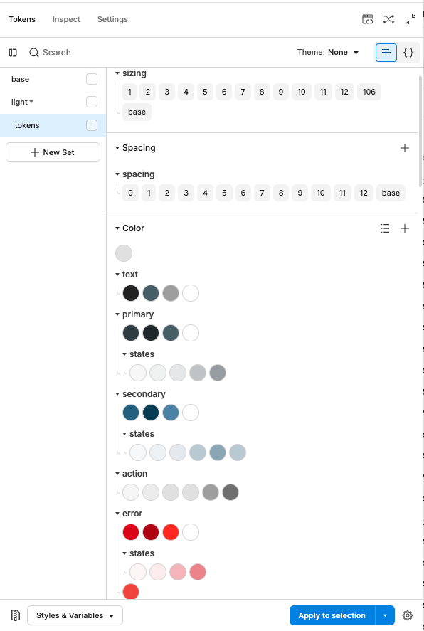
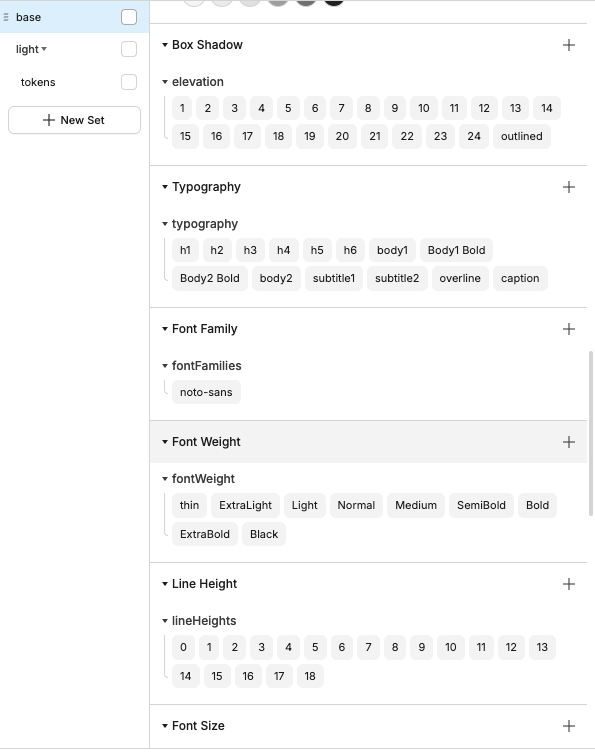
4. Building the Design Token System
I introduced a token system in Figma:
Tokens for color, spacing, radius, elevation, typography
Synced with GitLab to ensure consistency across design and code
5. Creating a Scalable Figma Library
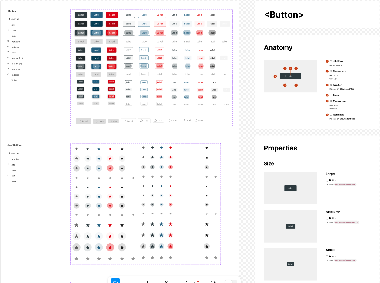
I rebuilt all components in Figma:
Used auto layout, variants, and tokenized styles
Matched structure and props from the codebase
Documented usage and states within Figma
6. Building Components with Variant Logic
Each component was built to handle real-world usage through structured variants—mirroring how props work in code. This structure made components flexible, consistent, and developer-friendly.
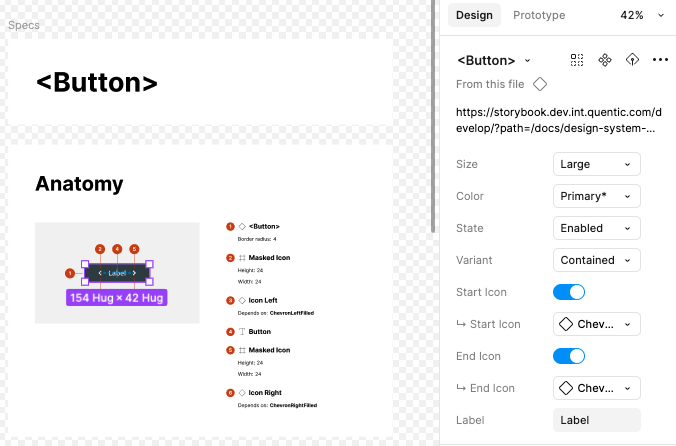
7. Collaborating with Developers
I partnered with devs to:
Sync tokens and test components in Storybook
Extend and maintain our custom theme in GitLab
Align on naming, behavior, and responsiveness
This wasn’t just about building design assets—it was about creating a unified system our whole team could rely on.
The Outcome
1. Faster Design-to-Dev Handoff
Pre-built components and synced tokens eliminated repetitive questions. Design handoffs became faster, clearer, and required less back-and-forth.
2. Shared Design-Development Language
By aligning Figma tokens and MUI theme values, designers and developers spoke the same language. Styles were no longer "interpreted" in code—they were implemented exactly.
3. Scalable and Future-Proof
The system now supports new features, themes, and branding updates. One update to a token updates every component consistently.
4. Smoother Onboarding
With clear documentation and a reusable component library, new designers and devs could start contributing confidently in days, not weeks.
5. Stronger Collaboration Culture
Working cross-functionally from day one built a culture of trust. Our design system wasn’t owned by design or dev—it was built together.
