AI-Assisted 5 Whys
Bringing a methodology into the platform without taking it away from the user.
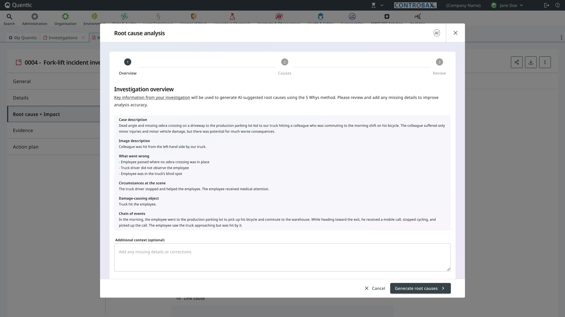
Four calls that shaped this design
Overview
Customers told the EHS team, in different words but the same shape: we run 5 Whys, but never inside the platform. The methodology lived in spreadsheets, meeting minutes, and the heads of senior safety officers. The platform’s investigation form had a Causes field that was, in practice, used to copy-paste conclusions reached elsewhere.
AI-Assisted 5 Whys is the feature that brings the methodology into the platform. It’s the canonical Mid-Level AI example in our AI design system: an AI assistant that proposes structured output, a contained workspace where the user reviews and refines, and an explicit handoff to the existing form when the user is done.
What I owned:
- ✔ The flow. A three-step wizard from prompt to suggestions to review.
- ✔ The data-quality pre-flight. The system inspects what it has before AI runs, and warns the user when the input isn’t strong enough to produce reliable output.
- ✔ The cascade rules. What happens to a 5 Why chain when the user edits one node, and how the system tells them.
- ✔ The boundary between AI’s grid and the existing form. AI gets its own space; the user keeps theirs.
- ✔ The research. What 5 Whys looks like in the wild, what the methodology actually requires, and where AI helps versus where it pretends to help.
The problem
Three customer quotes sat at the top of the brief:
“We run 5 Why sessions, but always outside the platform.” “We only use the Causes field to copy over what was already analyzed offline.” “Less experienced staff struggle to move beyond symptoms and find real root causes.”
That last one is the most interesting design problem. The 5 Whys methodology is simple to describe and hard to do well. Why did the spill happen? The valve failed. Why did the valve fail? It wasn’t inspected. Why wasn’t it inspected? The technique works only if the user keeps pushing past comfortable answers. New investigators stop at “human error” and write that down. Senior investigators keep going.
So the brief wasn’t automate 5 Whys. It was help less experienced people do better 5 Whys, without making the methodology disappear into a black box.
The approach
The decisive call I made early: the AI gets a wizard. The existing form keeps its authority.
"The AI gets a wizard. The existing form keeps its authority."
The alternative I rejected: putting AI suggestions directly into the existing Causes field. That would have been faster to build and worse for the user. It would have collapsed the boundary between AI’s reasoning and the user’s record. Once mixed, the user can’t tell what they decided versus what the AI decided. Audit defense becomes guesswork.
Instead: AI works inside a wizard. When the user confirms, the result lands in a new grid called AI Suggested Causes, placed above the existing Causes field. The user can edit any item in the new grid. The existing field is untouched and continues to behave the way it always has.
Two domains, both visible. AI proposes in its own space; the user keeps theirs.
AI's domain · Editable · Removable · Retryable
Stored as plain text · Not linked to master data
User's domain · Master-data linked · Always writable
Untouched by AI · The user's authoritative record
Two surfaces, one investigation form. AI proposes above; the user records below.
The wizard, three steps
1. Prompt, with a data-quality check before AI runs
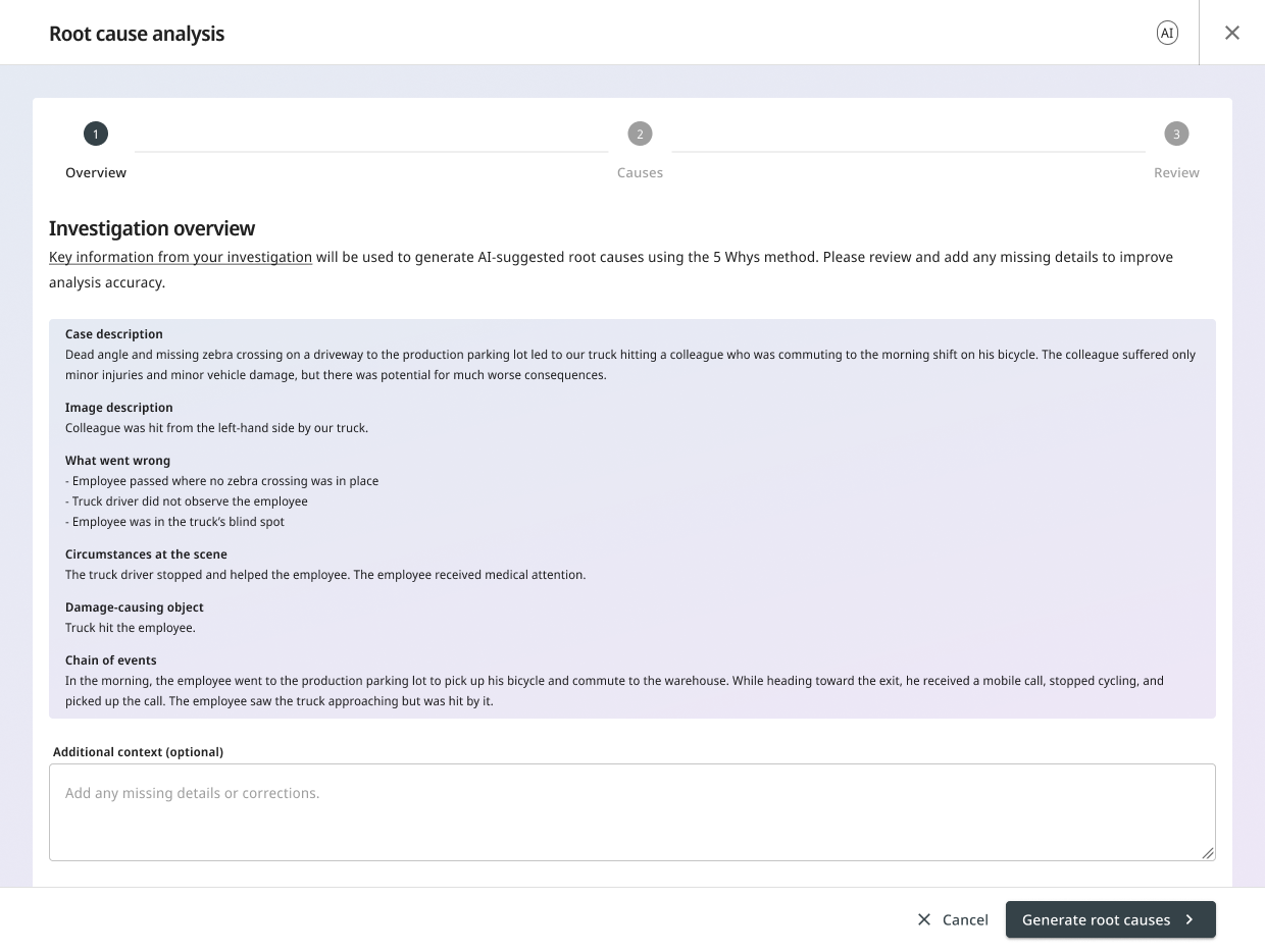
The wizard opens with the case and investigation context already pulled in: description, what went wrong, circumstances, chain of events. The user doesn’t paste, summarize, or re-explain. The platform already knows what the incident is.
Before generation, the system runs a quiet check: is the available data strong enough to support a useful analysis? If it isn’t, the user sees a warning that makes the AI’s limits visible:
Your description is very short. AI will generate a summary, but the result may be generic. The quality of the root cause analysis depends on the data quality.
The user can add context in their own words and try again, or proceed knowing the result will be weak. The point isn’t to gate the user. The point is to refuse silent confidence. The AI doesn’t pretend it can produce a strong result from thin data.
2. Suggestions, revealed sequentially
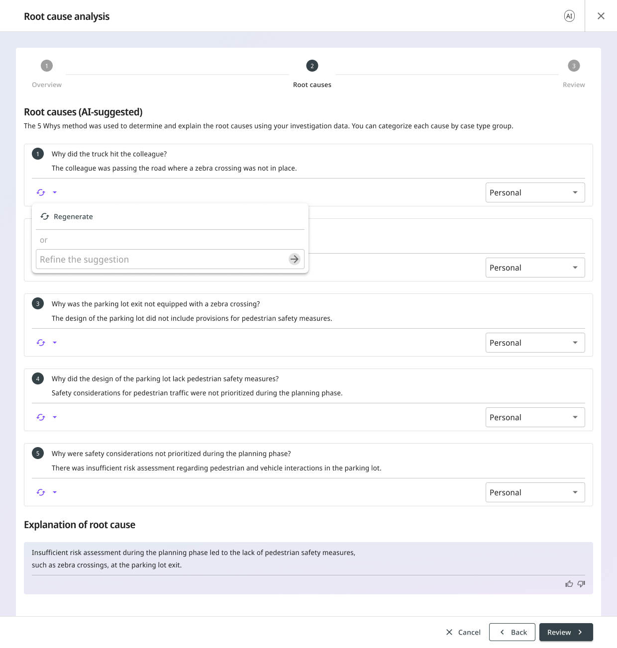
The AI returns:
- Cause groups mapped to the customer’s existing master data categories (e.g., Manpower, Method, Machine).
- A 5 Why chain for each cause group, ending with an identified root cause.
The Whys appear one at a time, with a brief delay between them. Why 1, then Why 2, then Why 3. The reasoning unfolds rather than landing all at once.
This is a tone choice. A loading spinner followed by a finished block of conclusions feels like magic. A sequential reveal feels like thinking. Magic invites trust where trust hasn’t been earned. Thinking invites the user to follow along.
The user can refine in two ways, and the difference between them is the design call worth highlighting:
Targeted feedback. Click into a Why, type a short note (“this should be about training, not equipment”), submit. The AI updates that Why. The downstream Whys may also change because they were derived from it.
Regenerate. Click Regenerate on a Why. The AI starts that Why over and may also change the Whys derived from it.
Both are destructive in their own way, and both surface that fact:
Regenerating the Why may change the following Whys and the root cause. Do you want to continue?
The user confirms or cancels. No silent overwrites. The cascade isn’t hidden; the cascade is the warning.
Any destructive action surfaces what it will affect before proceeding.
The user can also re-classify the cause group from a dropdown without triggering a regeneration. Sometimes the AI’s reasoning is right but its category is wrong. Letting the user fix the label without resetting the chain saves work and respects the user’s domain expertise.
3. Review and confirm
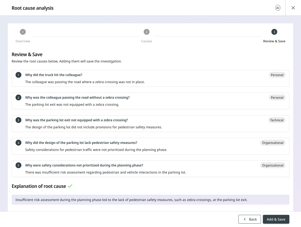
The user sees the final shape of the analysis: cause groups, the chain that led to each, and the identified root cause. Saving is explicit. Nothing is written to the investigation record until the user confirms.
The AI Suggested Causes grid
When the wizard saves, the result lands in a new grid placed above the existing Causes field in the investigation form.
The grid:
- Has one column. Cause groups, each expandable to reveal the 5 Why chain inside.
- Stores plain text. Each cause is editable, gated by the same investigation permissions the rest of the form uses.
- Allows granular removal. Each cause has a checkbox; toggling it off removes that cause from the record. The AI doesn’t get to defend itself.
- Doesn’t link to causes master data. That was a deliberate MVP scope call. Mapping AI output to a customer’s hierarchical master data needed more research. The manual Causes field below the grid still supports master data linking the way it always has.
At the bottom of the grid, one button: Retry root cause analysis. Clicking it warns the user that the existing AI causes and root cause will be overwritten, then reopens the wizard.
One edge case: remove every AI cause and the system clears the grid and reopens the wizard rather than leaving an empty surface.
What we tested and learned
The wizard didn’t ship straight from sketch. Six months before launch, two concepts went head-to-head in a moderated usability study with real customers, and the most interesting result was the one we chose not to follow.
The study
The team designed two concepts in parallel and prototyped both in Axure. Concept A had four steps, including a dedicated editing step between AI suggestions and final review. Concept B condensed it to three, with refinement folded inside the suggestions step itself.
A user researcher led six think-aloud sessions with EHS specialists and operations supervisors from six different customers across multiple industries (manufacturing, food production, leisure, infrastructure). Each participant tested both concepts in counterbalanced order. Three research questions framed the study, but one mattered most: how do users perceive the AI’s role: assistant, guide, or decision-maker? Each of those is a different relationship with the user, and each implies different defaults for the UI.
The study also confirmed the original design hypothesis on the target user. Two participants explicitly noted the feature would be most useful for inexperienced investigators who tend to stop after one or two whys, which echoed the brief directly. One participant added that responsibility for root cause analysis is now moving from safety coordinators to operational managers: younger, less experienced, more in need of structure.
The surprise: users preferred the concept we didn’t ship
Four of six customers preferred Concept A. Only one preferred Concept B, the three-step version that shipped. The reason was consistent: Concept A had a dedicated step for editing AI-generated content before saving, and five of six participants singled this out as the most valuable thing in either concept. Editing the AI’s output manually was the load-bearing finding of the entire study.
"Editing the AI's output manually was the load-bearing finding of the entire study."
The PM called three steps. I didn’t ignore the finding. I pulled the editing affordances forward into Concept B’s Step 2: per-Why Refine, per-Why Regenerate, and cause-group reclassification all became inline actions on the suggestions, not a separate step. The post-save grid added more: per-cause text edits, granular removal, and Retry. The shape became three steps; the editing power that participants valued in Concept A was preserved everywhere it mattered.
The dedicated edit step from Concept A wasn't cut. It was dissolved into Step 2 and the post-save grid.
Other findings that shaped the design
The research team rated each finding by severity. Each one mapped directly to a shipped design decision.
Cascade-rule confusion (major). Three of six weren’t sure whether manual edits would trigger further AI updates. Shaped the cascade warning: any destructive action surfaces what it will affect before proceeding.
Data-quality concern (major). Three of six flagged it as a top concern. Shaped the pre-flight check on Step 1: thin input triggers a warning before generation runs.
Cause-type confusion (medium). Choosing a cause type was the most confusing part of the flow. Shaped the AI’s automatic cause-group suggestion, with a dropdown to override.
AI replacement concern. Multiple participants worried AI would displace the human work of investigation. Confirmed the target audience: operations supervisors, not senior EHS officers. The same concern is also why the AI gets a wizard and the existing form keeps its authority.
The thread running through every finding: position AI as a supporting tool, not a replacement.
What we deferred, and why
Master data mapping for cause groups. Three of six participants surfaced this directly: the tool should choose from the company’s own specific list of root causes, not generic AI labels. Every customer’s taxonomy is different. Forcing the mapping would either over-constrain the AI (making it choose from a fixed list it doesn’t understand) or generate noise (mapping the AI’s labels to wrong customer categories). For MVP, cause groups are stored as plain text in the new grid. We’ll revisit master data mapping once we see how often users reclassify (see below).
Tree-based root cause analysis. Two of six found the 5 Why method too linear and asked for a tree-based approach that lets multiple root causes branch from one incident. That’s a larger product question than the MVP scope: not just a UI change but a different methodology. A candidate for the next iteration.
What I designed to measure, and why
The wizard makes design assumptions I have no data to validate yet: that users trust the AI’s output enough to accept it, that three steps is the right granularity, that the post-save grid is doing useful work rather than patching a wizard gap. The instrumentation specified for the MVP exists to test those assumptions, not to count clicks.
Each signal I asked the team to add answers a design question. Five questions, in priority order.
Does the wizard carry users through?
Two funnel ratios: entry-to-Step-2 (does the AI’s output load and convince?) and Step-2-to-save (does the output get committed?). Where users cancel matters as much as whether they cancel. Step 1 exit = framing missed. Step 2 exit = output didn’t convince. Step 3 exit = review surfaced something unfixable in-wizard. Each pattern implies a different fix.
How much do users edit what the AI gave them?
Every Refine, Regenerate, or reclassification is a measurable I don’t fully trust this moment. Refine frequency per Why position shows where the model is weakest. A high Regenerate-to-Refine ratio means the Refine affordance isn’t worth the effort: a problem with the UI, not just the AI.
Does three steps feel right?
Median time-to-save, segmented by user role. A 30-second median means rubber-stamping. A 5+ minute median means the review step is doing too much. A large gap between standard users and administrators tells me the defaults are tuned for the wrong mental model.
Is the grid earning its space?
Low edit-cause rate = the save-now-edit-later architecture is working. High remove-cause rate = the wizard is committing too eagerly. The retry rate tests the PM’s step-count call directly: four of six users preferred four steps, the PM called three, and a retry is a measurable I-still-believe-in-this-but-something-went-wrong moment.
What this unlocks
Each signal maps to a known next decision: wizard granularity, Refine UX, pre-save editing, Step 1 framing, cause-group taxonomy. Without the signals, every iteration on the wizard is opinion. With them, the argument is from evidence.
"Every iteration on the wizard is opinion. With the signals, the argument is from evidence."
What shipped
The MVP went live in the Investigations module behind a license toggle.
Early adoption from real customers. The instrumentation above is what comes next; the rest waits on usage.
The most important call wasn’t the wizard or the grid. It was refusing to let AI write into the existing form. AI got its own grid. The user keeps theirs. The compliance officer defending an audit can say I decided this about every line in the existing field, and the AI suggested this and I kept it about every line in the new grid. Two domains, both visible. That’s the design.