Design System
A fully customized MUI-based system that aligned design and dev with synced tokens.
Overview
What I owned:
- ✔ The audit that became the brief: cataloguing every component across the platform and mapping where design and code had drifted apart.
- ✔ The decision to build on MUI rather than from scratch, and the tradeoffs that required.
- ✔ The token system: every color, spacing, radius, elevation, and typography value defined once and synced to GitLab.
- ✔ The Figma library: component props mirrored to code props so developers reading a handoff never had to translate.
- ✔ The Storybook integration: components validated in the real environment, not just in isolation.
The problem
The surface symptoms were familiar: components built differently by different people, colors that existed in Figma but not in code, handoff meetings that were really disambiguation sessions.
But the actual problem was structural. Design and code were two separate sources of truth, and they drifted a little further apart every sprint. Figma held the intended state. GitLab held the actual state. No one was lying. The systems just weren’t connected.
New team members couldn’t resolve it. Designers didn’t know which component was canonical. Developers didn’t know which Figma value to trust. So everyone made their own call, and the inconsistency compounded.
The decisive call: build on MUI, not from scratch
The temptation in design system work is a clean slate: your own component names, your own architecture, your own token structure. I rejected that early.
The development team was already using MUI. A from-scratch system would have produced a Figma library that engineers translated back into MUI anyway, one component at a time, reintroducing the same drift the system was meant to fix.
Building on MUI meant I could design the system to map directly to the code it would become. Every component in Figma was structured to mirror its MUI props. A developer reading a handoff would find the same names, the same variants, the same states they’d already use in code. No translation layer. No interpretation gap.
The tradeoff: accepting MUI’s constraints on component architecture meant working within a structure I didn’t author. Some things I’d have designed differently from scratch. But a system that gets adopted beats a system that gets respected from a distance.
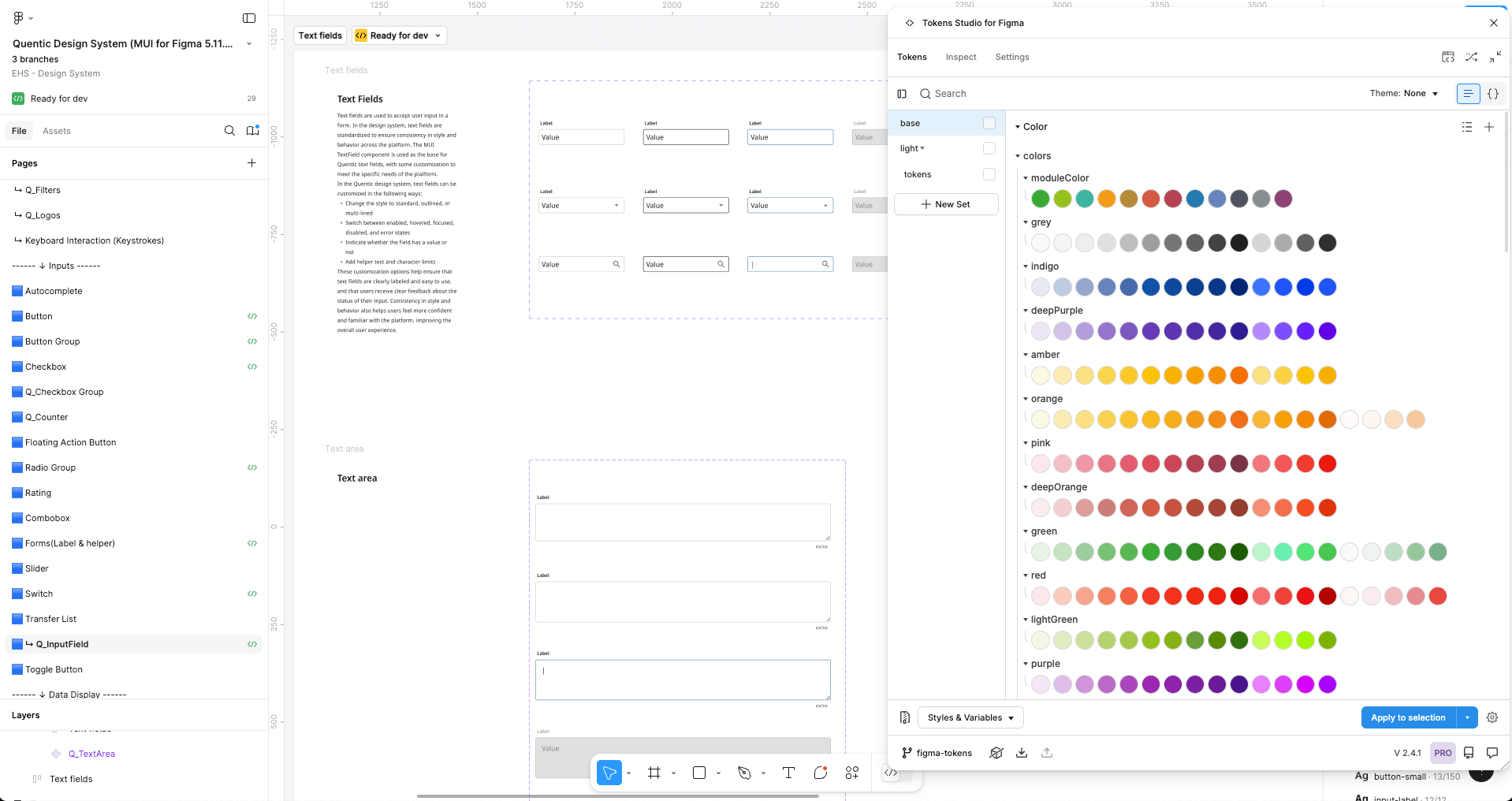
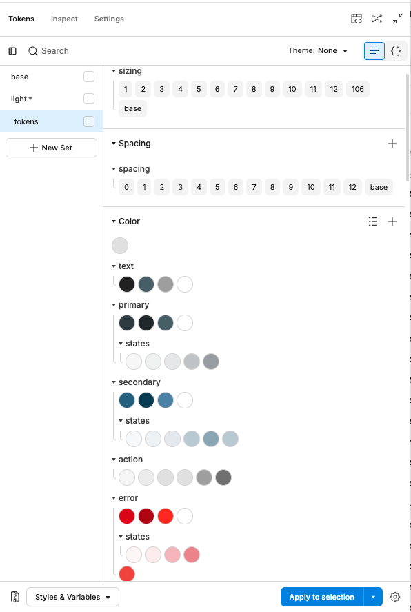
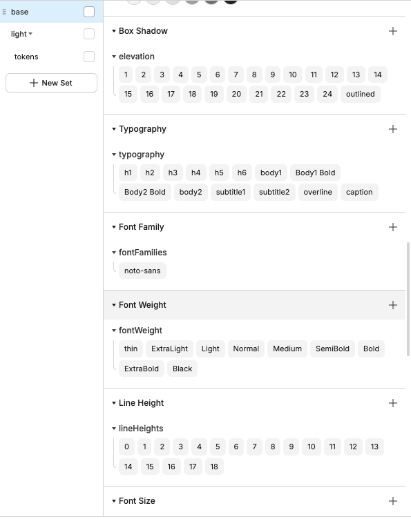
The token system
Tokens are where the system stopped being documentation and became infrastructure.
Every decision that could drift (color, spacing, radius, elevation, typography) was defined as a token in Figma and synced to GitLab. Not exported periodically. Synced. A change to a token propagated to the codebase automatically.
Source of design intent · Reviewed via branch workflow before merge
Prop names match Figma variants · Validated in real rendering
The consequence: a pull request using the wrong color value could be caught at code review against the token. The token became the rule, not the recommendation. The AI design system I later authored used the same infrastructure: colors/AI/Accent exists as a token, which is why the sparkle icon can’t accidentally become a success color in a PR.
The Figma library
The library was built to mirror how the code worked, not how design tools usually work.
Each component used Figma’s variant system to map to code props. A button component had variants for variant (contained, outlined, text), size (small, medium, large), color, disabled, and loading, mirroring the same props a developer would pass in code. Auto layout matched the component’s real rendering behavior.
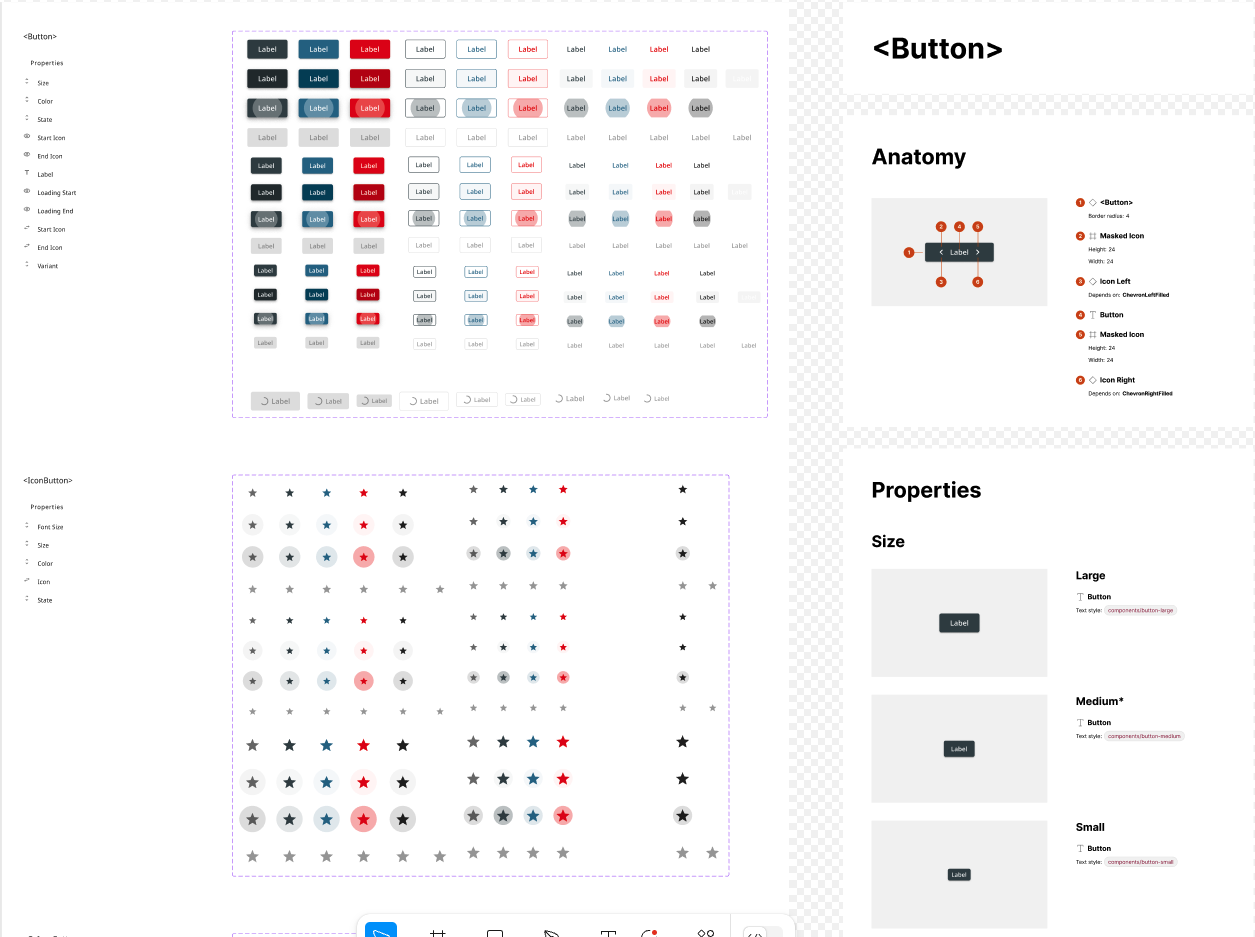
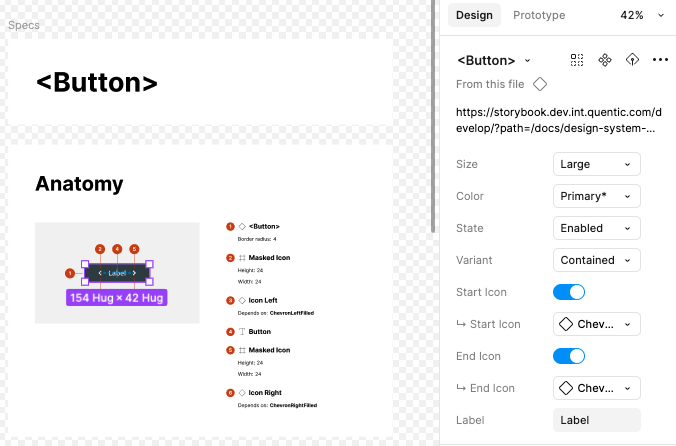
Documentation lived in Figma next to the component: usage rules, do/don’t examples, and a link to the Storybook story. Components were tested in Storybook before being considered stable, validated against real rendering rather than just pixel-checked in isolation.
Governance
A design system without a change process degrades. Components drift, tokens get overridden locally, and the library becomes a suggestion rather than a source of truth.
The process I put in place mirrors how the engineering side handles code changes. Any designer who wants to modify the system creates a branch directly in the Figma file. The branch captures the proposed change in isolation, leaving the main library untouched. Other designers are assigned as reviewers. The change only merges into the main library once it’s been approved.
This keeps the system from becoming one person’s file. Changes are visible, reviewable, and reversible before they affect the whole team. A designer contributing a new component state goes through the same review loop as an engineer opening an MR, which means the bar for what enters the system is consistent regardless of who proposes it.
What changed
Faster design-to-dev handoff
Handoff clarification dropped significantly once tokens and props matched. The question “which blue is this?” stopped being asked, because the answer was enforced, not suggested. Designers and developers were referencing the same value, in the same place, with the same name. Handoffs became faster, clearer, and required less back-and-forth.
Shared design-development language
By aligning Figma tokens and MUI theme values, designers and developers stopped interpreting each other’s work. Styles were no longer translated in code. They were implemented exactly. Both sides used the same names for the same things.
Scalable and future-proof
Because every value is a token, the system scales without manual updates. A brand change, a new theme, a module rebrand: one token update propagates to every component that references it. When the next feature shipped, the designer didn’t rebuild the button. They composed it.
Smoother onboarding
New designers and developers were contributing confidently in days rather than spending their first week figuring out which component to use, which Figma file was current, or whether something already existed.
Stronger collaboration culture
The system wasn’t owned by design or by dev. It was built together, reviewed together, and maintained together. Working cross-functionally from the start built a culture where the design system was a shared tool, not a handoff artifact.